Booking.com
Conducted a design critique and redesign concept of the Booking.com app’s search flow, focusing on enhancing usability and visual harmony by addressing inconsistencies and improving the overall user experience.
Audit
I identified several key issues in the app, including a lack of design patterns, poor harmony among UI elements due to an inconsistent design system, and a confusing search experience where category changes resulted in loss of user input. Additionally, some areas lacked context, making it difficult for users to understand the content, and the search results pages were cluttered with low legibility.
Redesign Process
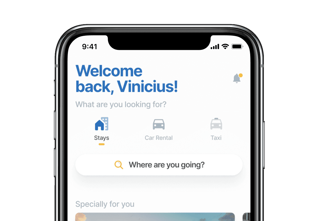
To address these issues, I turned to Airbnb and SkyScanner as primary visual references. Both apps have well-structured search flows with clear patterns that enhance usability. I used these references to guide the redesign, applying industry standards that users would find familiar.
The main objective of my redesign was to create a clearer, more intuitive experience for the user, adhering to industry standards to make the flow more predictable. I focused on reorganizing the information, defining clear hierarchies, and eliminating unnecessary visual clutter.
I developed a simple prototype in Figma, emphasizing the user interactions and transitions. This allowed for an easy comparison with the current Booking.com app, clearly demonstrating how the proposed changes would improve the user experience.
Challenges & Outcome
The most challenging part of this project was organizing the information effectively. Identifying groups, hierarchies, and essential data required careful consideration to ensure that the final design would be both functional and user-friendly.
The success of this project led to an offer from Zygo for the position of Senior UI Designer. However, I decided to continue my career at ArcTouch, as I saw more promising opportunities for growth there.