Moove
Visual identity and brand applications for Moove Wellness Club, a multi-modality Brazilian fitness network: a clearer infinity mark, then apparel, merch, and campaigns that carry the brand from the locker room to the wall.

From every practice, one brand
Moove Wellness Club brings pilates, yoga, dance, jiu-jitsu, and wellness under one roof. The old mark fought that reality: fragile at small sizes, easy to confuse with generic gym type, and too rigid for every context a club like this needs.
I rebuilt the identity so it could stay sharp on a hoodie, clear on a bottle, and flexible across campaigns, then carried it into the applications members actually touch.
Identity system
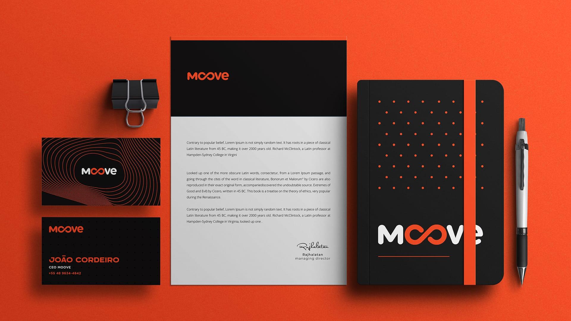
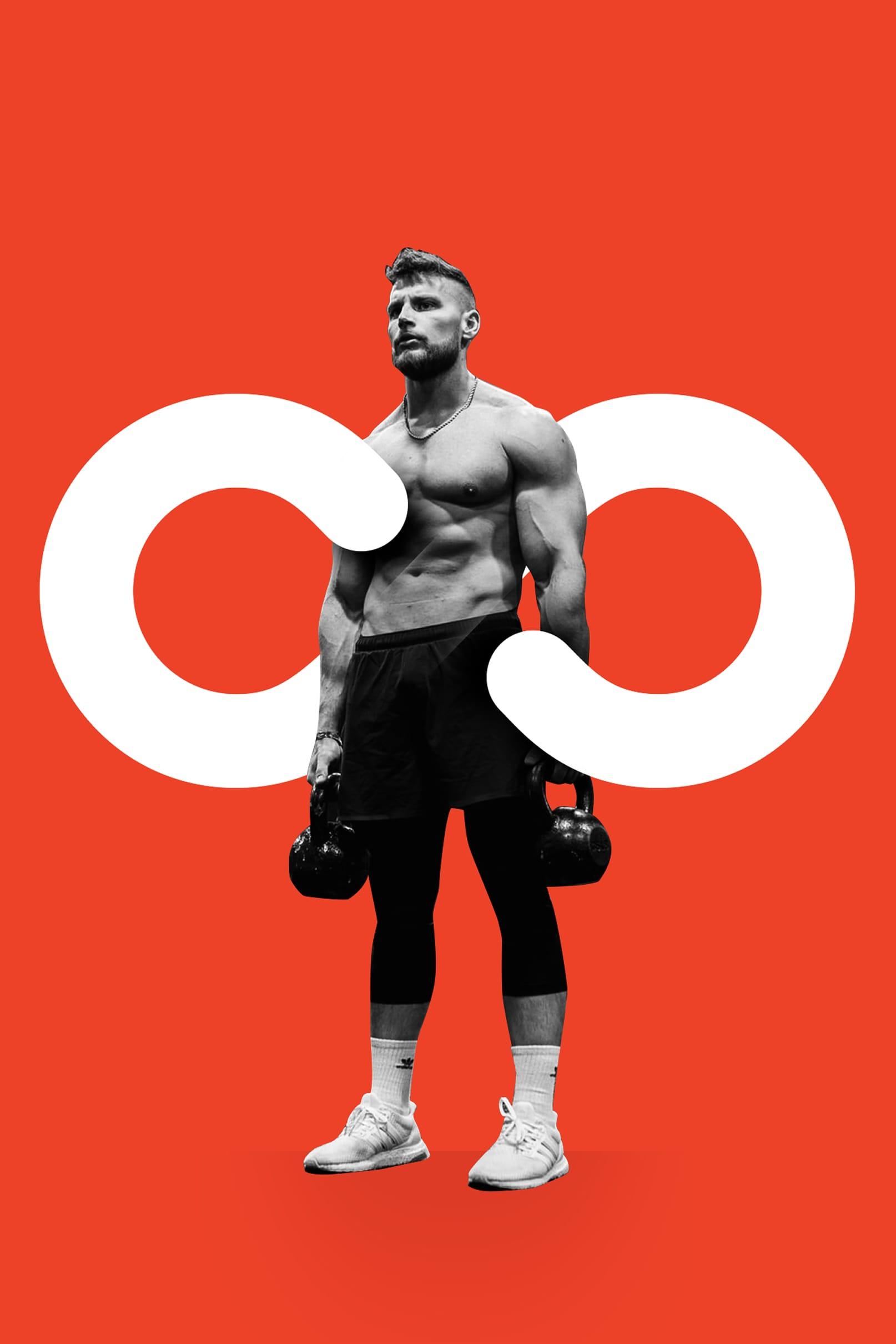
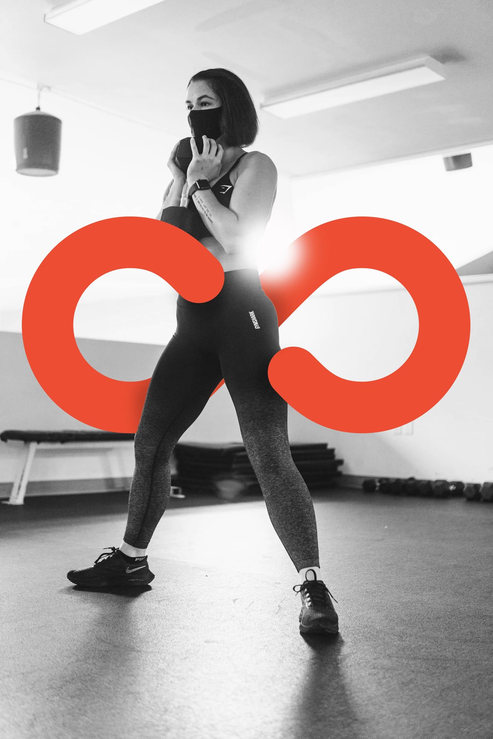
The infinity mark is the heart of Moove: strong enough to stand alone as an icon, and clean enough to sit with the wordmark in brand orange, black, or reverse. The system is built to scale, reverse, and print without drama, from large outdoor lettering down to embroidery.
In the club
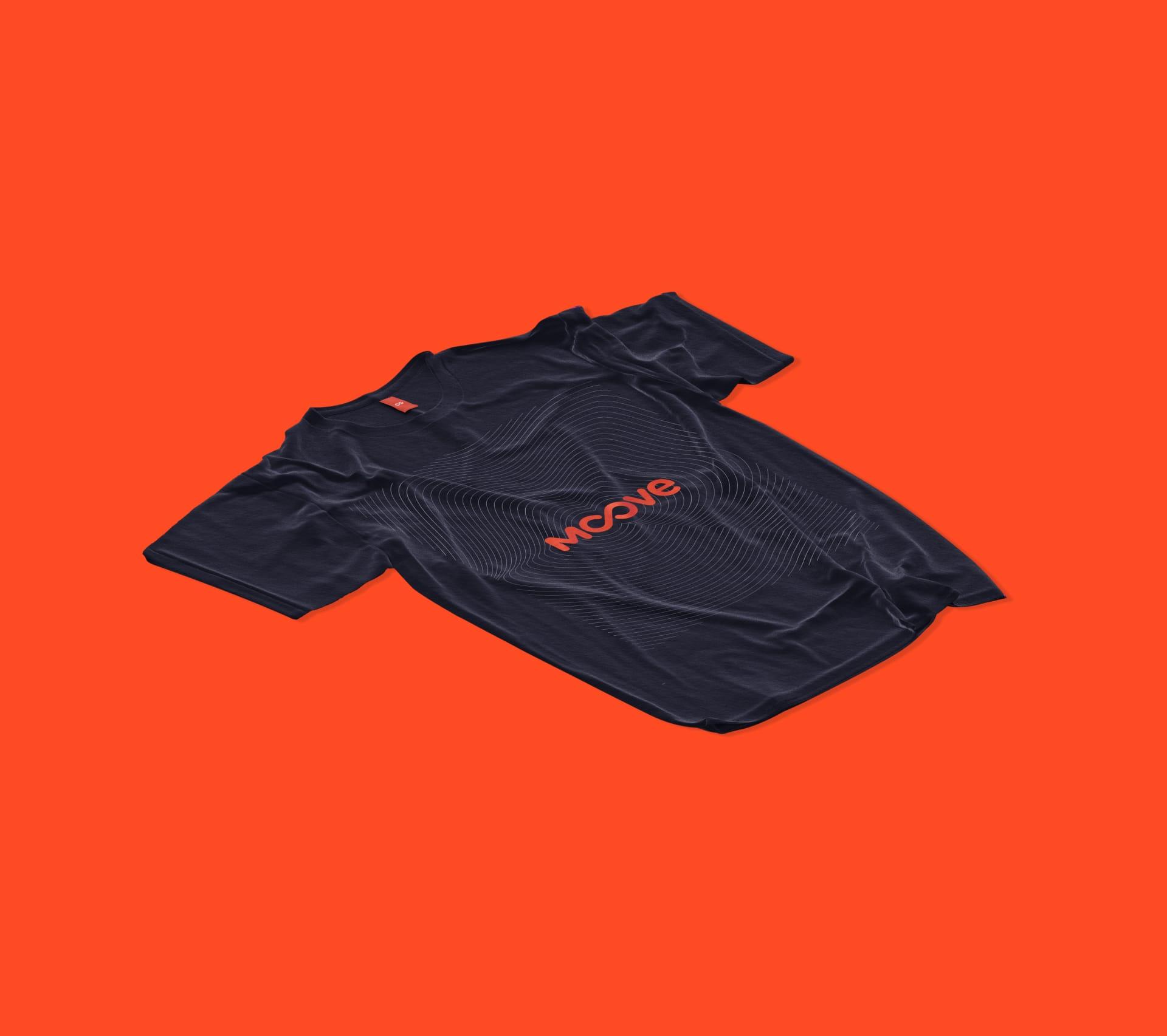
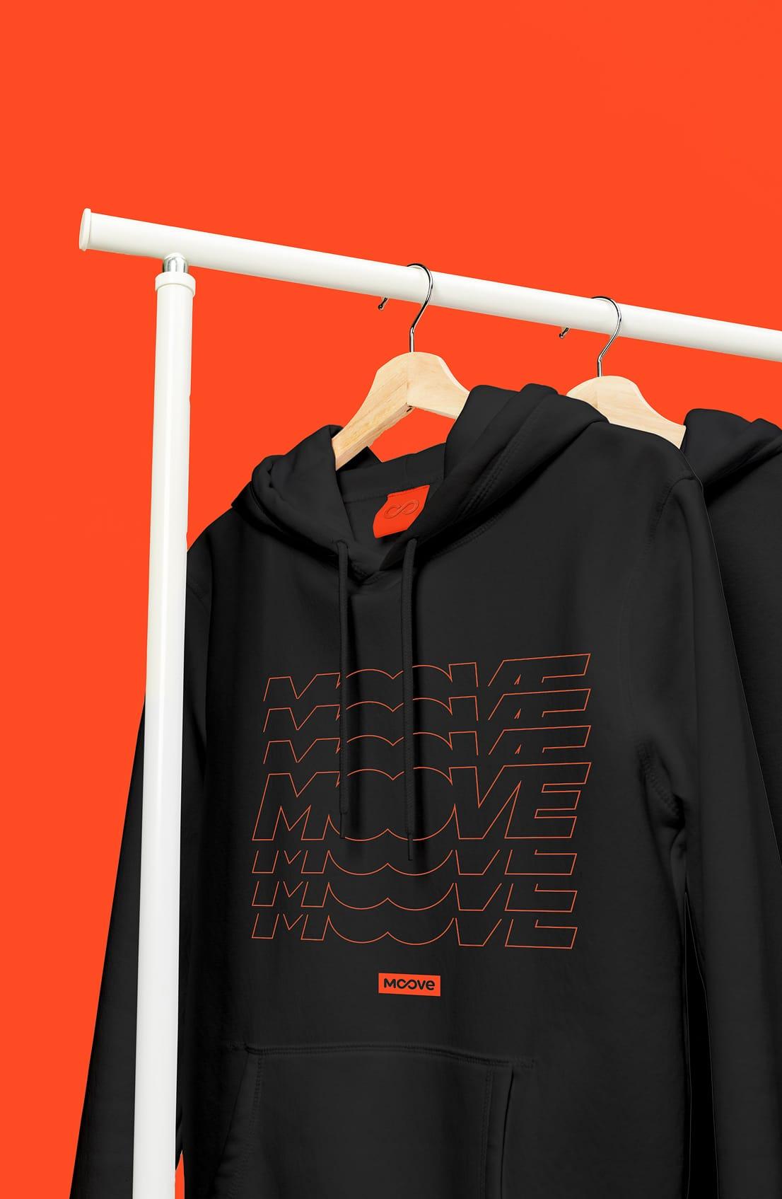
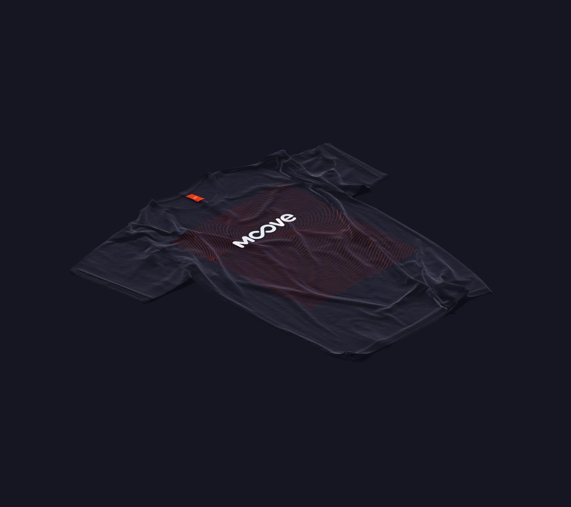
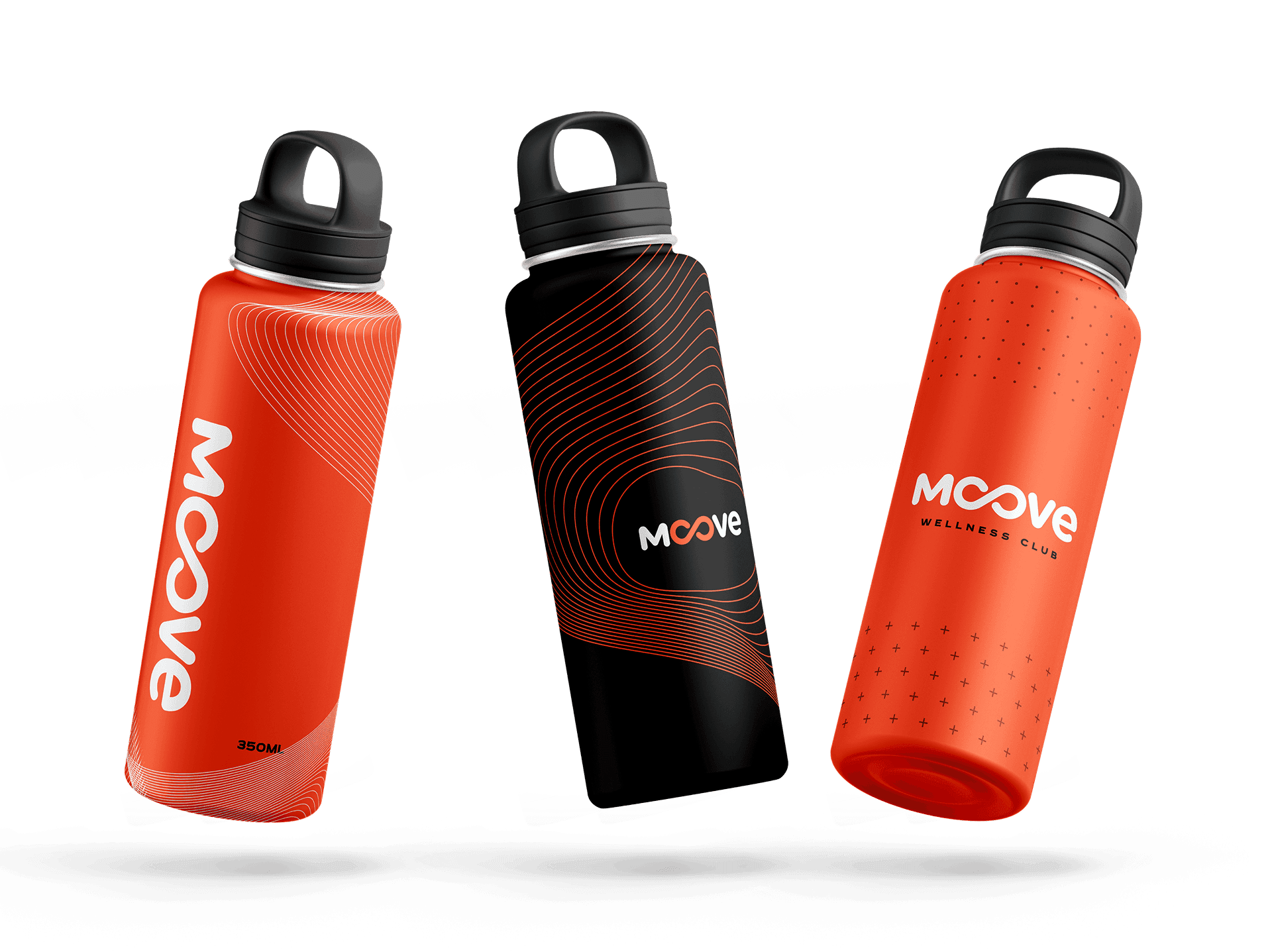
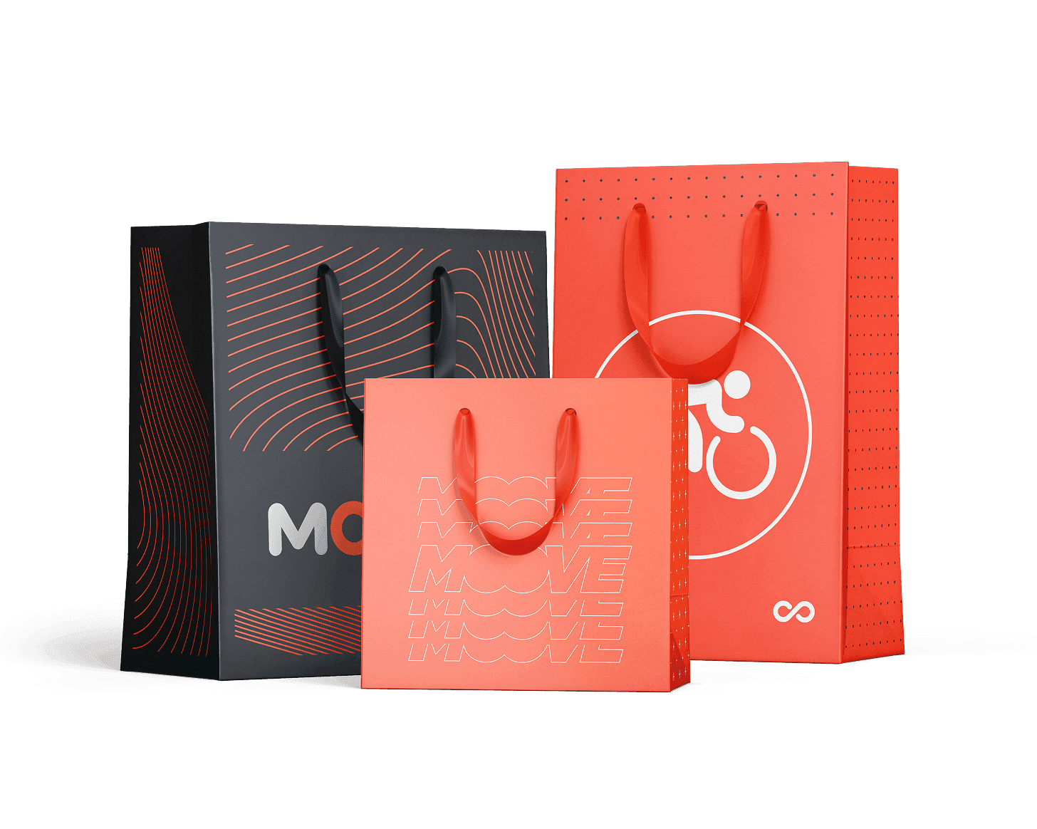
A wellness brand has to survive the floor, not only the deck. I applied the system to hoodies, tees, bottles, and bags so members wear and carry Moove between classes.
Modalities, one system
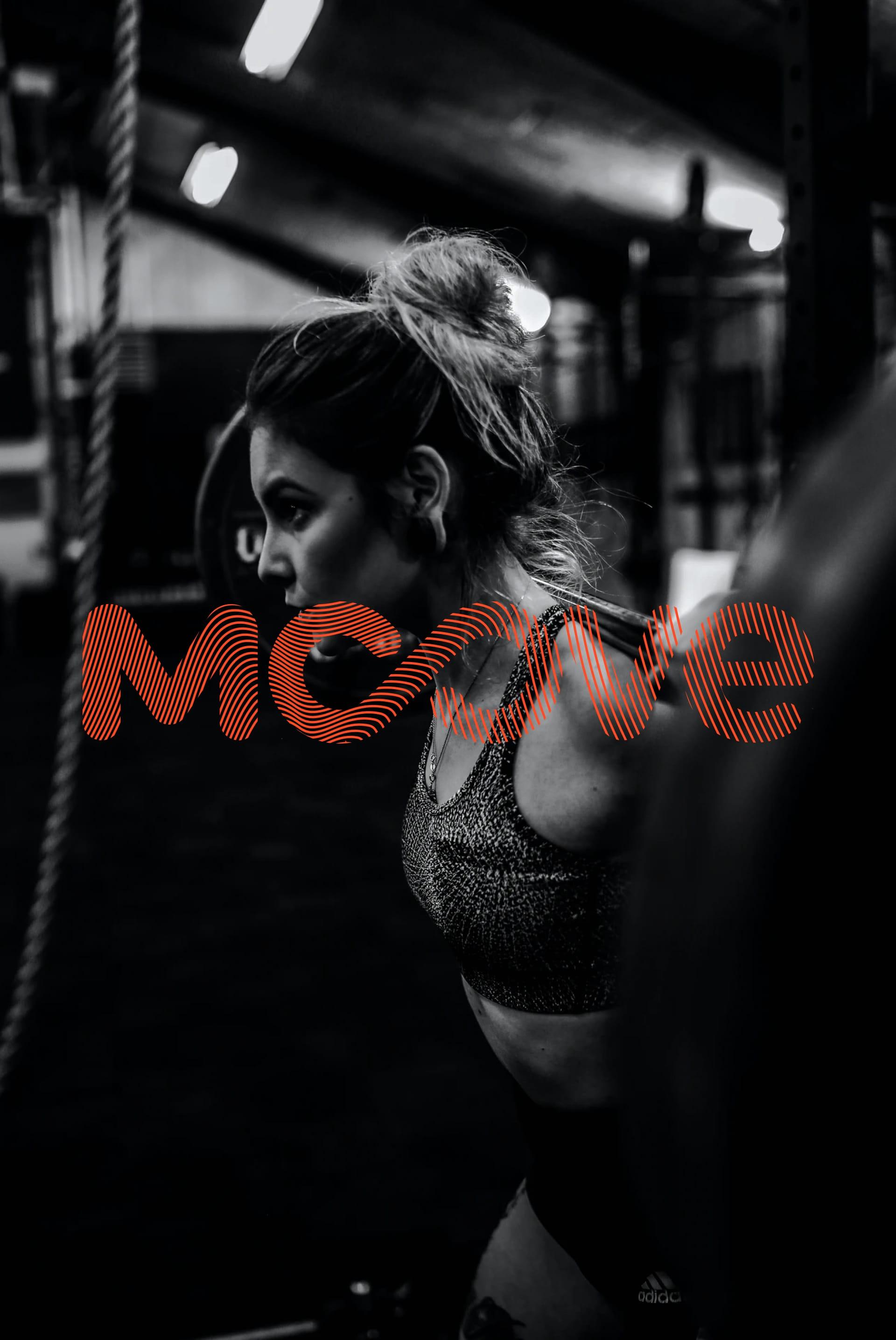
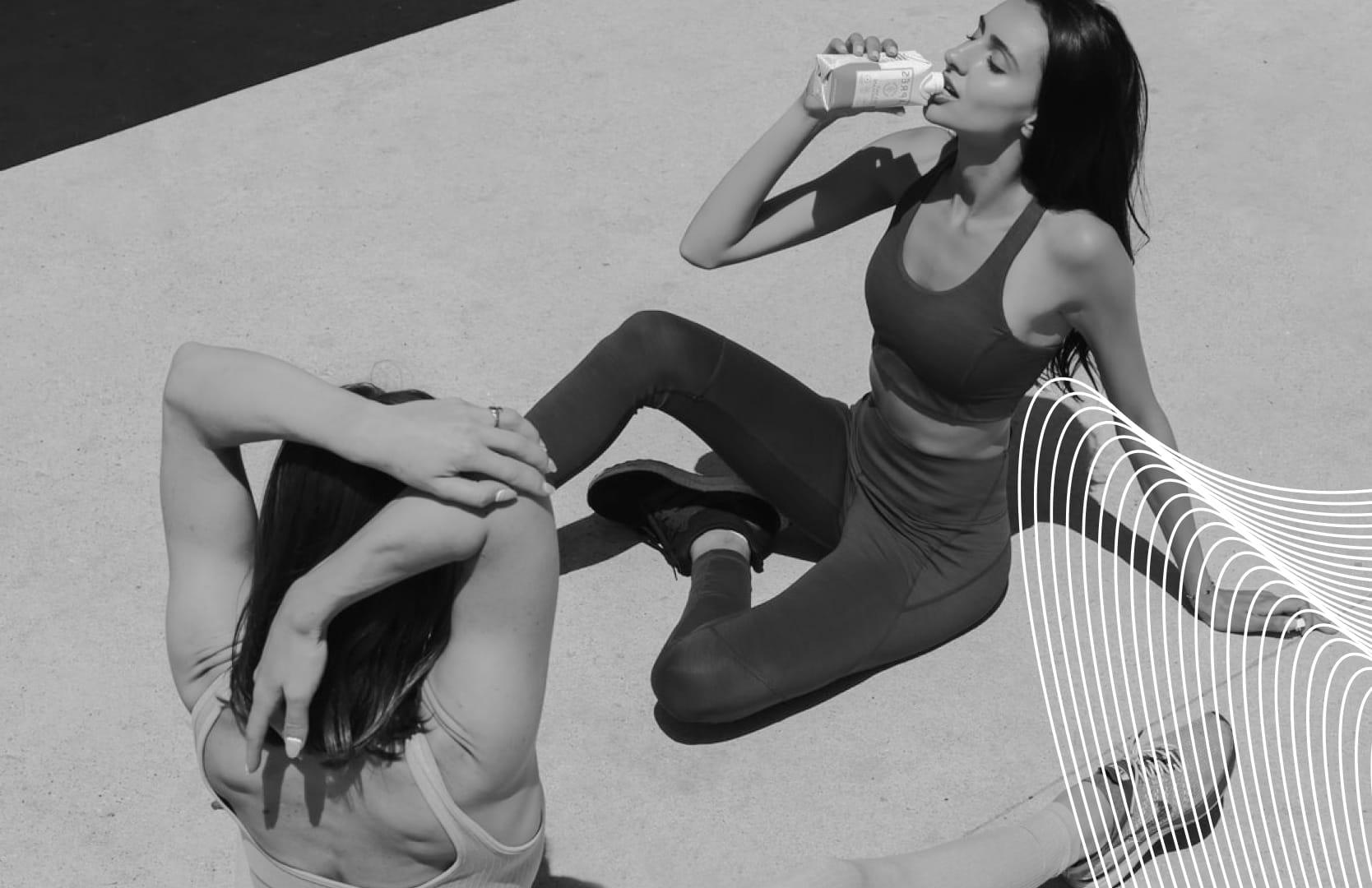
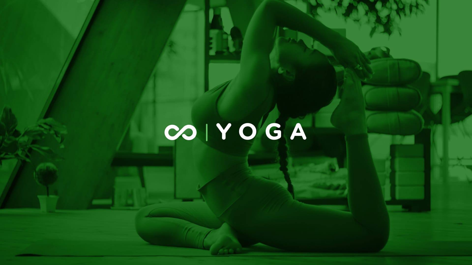
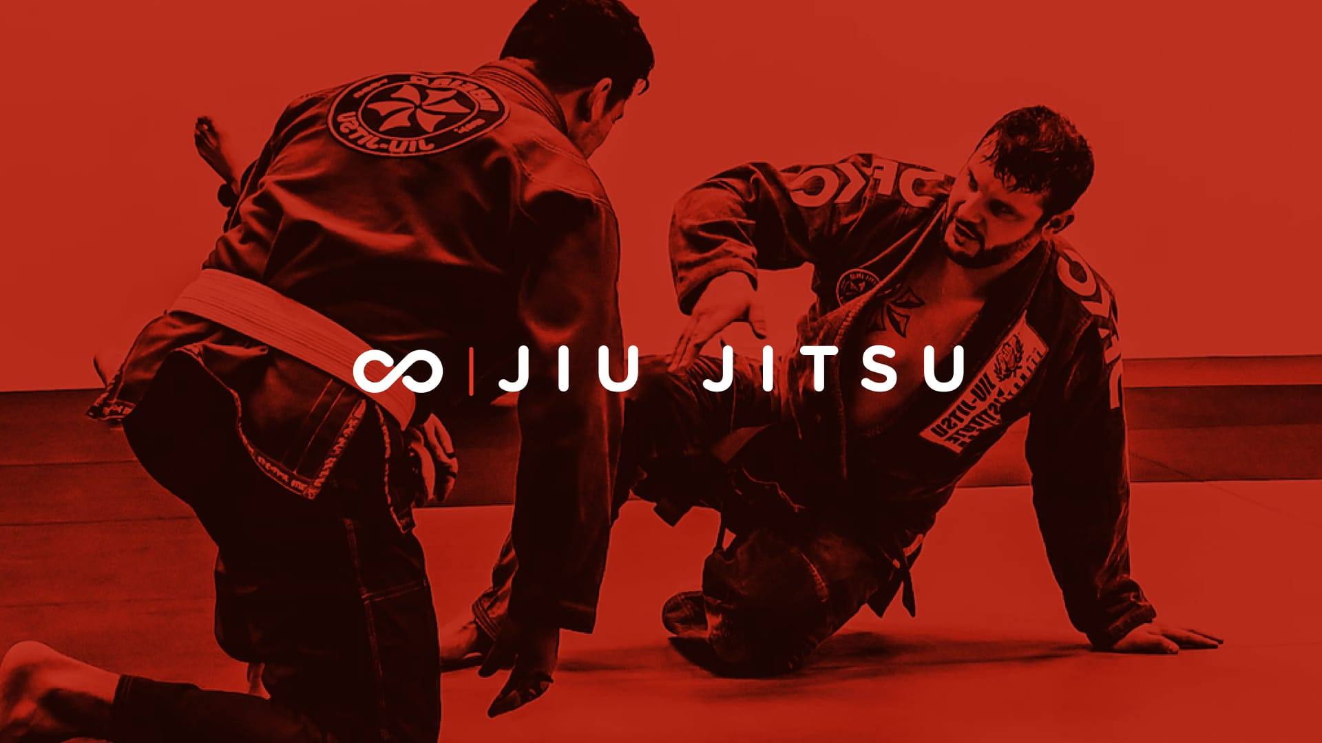
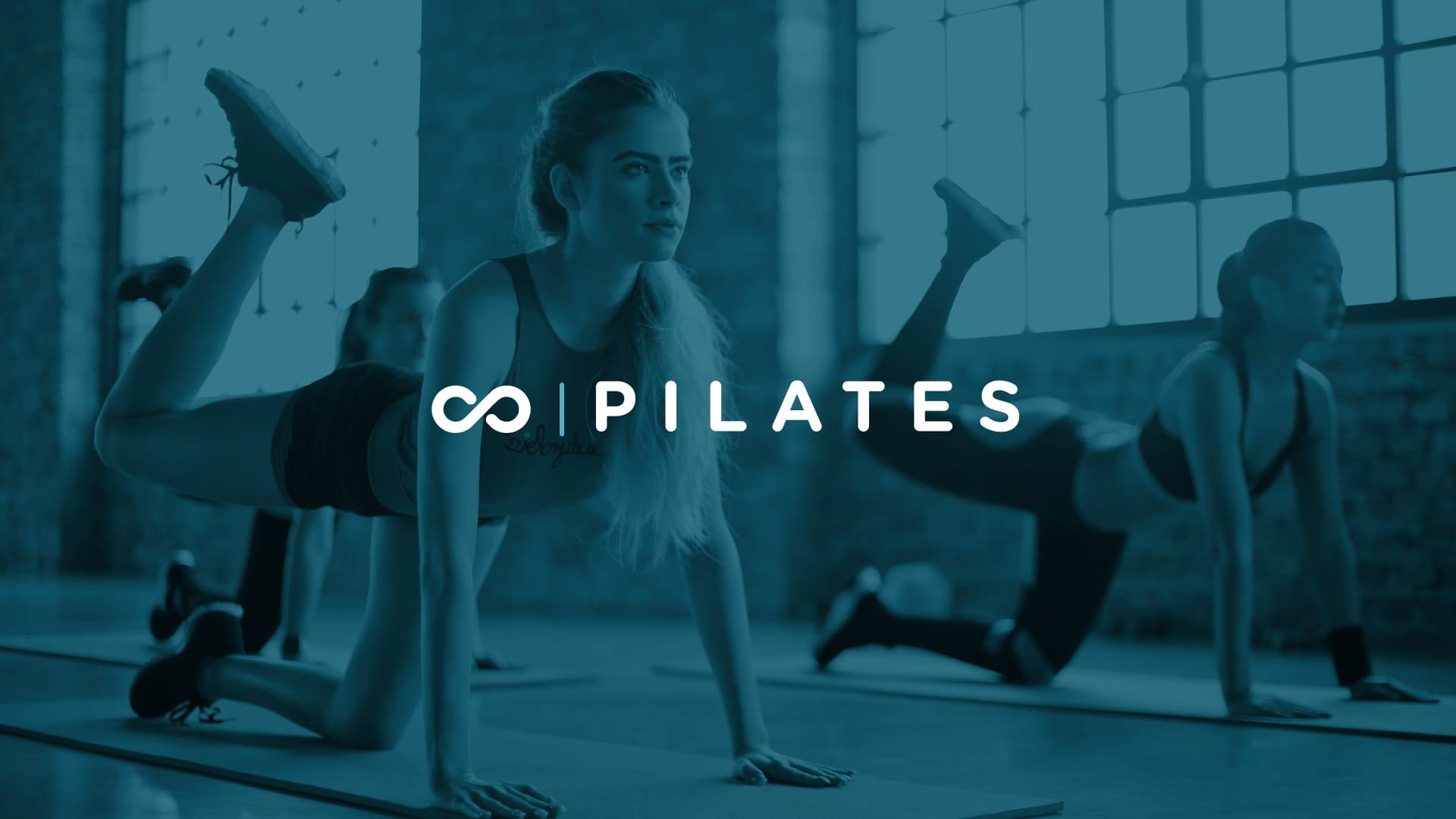
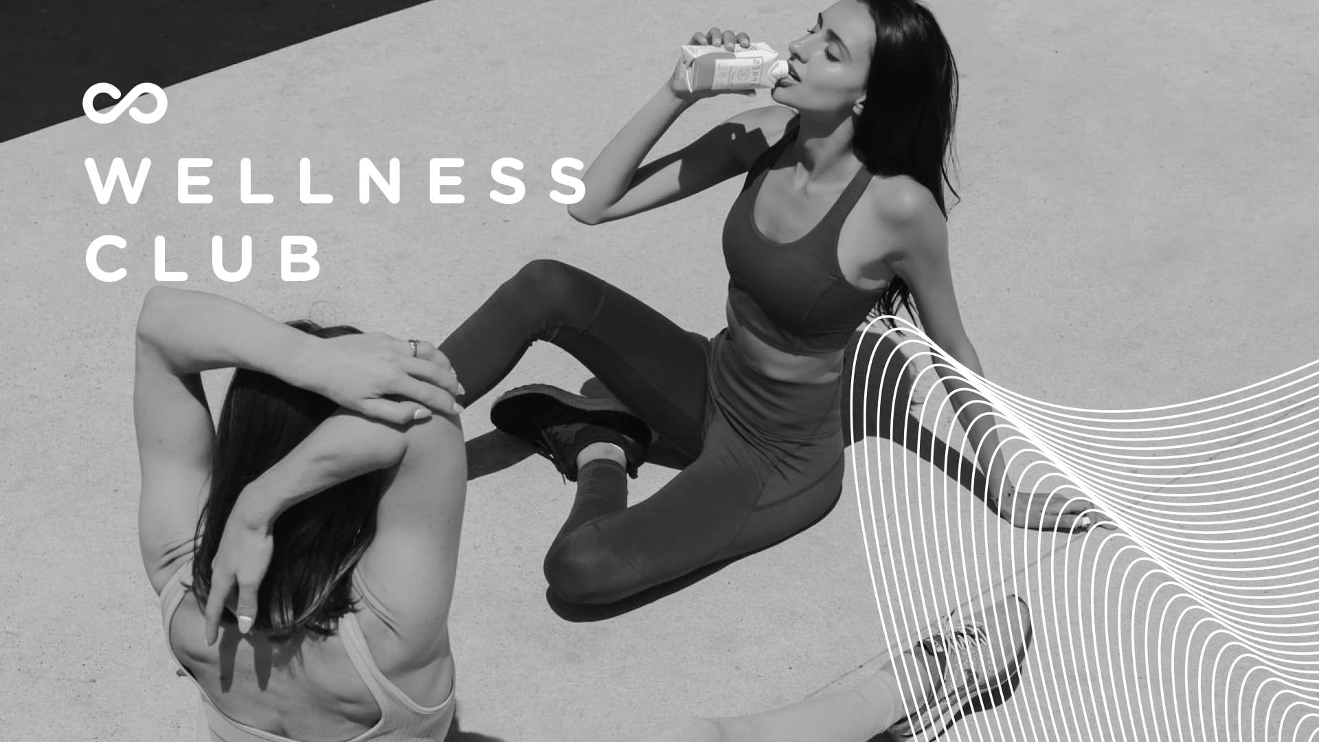
Many practices, one brand. Campaigns for wellness, yoga, jiu-jitsu, and pilates share the infinity mark and brand color, while photography keeps each class feeling like itself.
Print and promotion
Beyond the floor, I designed poster systems and infinite-tile layouts so walls, windows, and seasonal communication stay on-brand without starting from zero every time.
The brand book closed the project for the teams that print, post, and open doors every day, so new pieces can keep feeling like Moove without starting from a blank file.